






Why Simple Games Demand Precise Art Direction
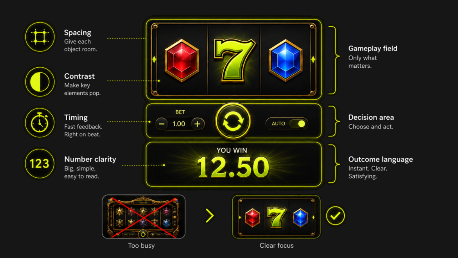
When a game has few objects, every object carries more meaning. A weak selection state, unclear multiplier or delayed result cannot hide behind a cinematic scene. Simplicity increases the importance of spacing, contrast, motion timing and numerical typography.
Strong compact games establish one dominant gameplay field, one decision area and one outcome language. Decoration supports those layers instead of becoming a fourth source of attention.
This is a practical example of the broader principle described in How Art Direction Impacts Slot Game Success: visual choices should serve the product’s behavior, not merely its theme.
Plinko: Make Probability Feel Physical
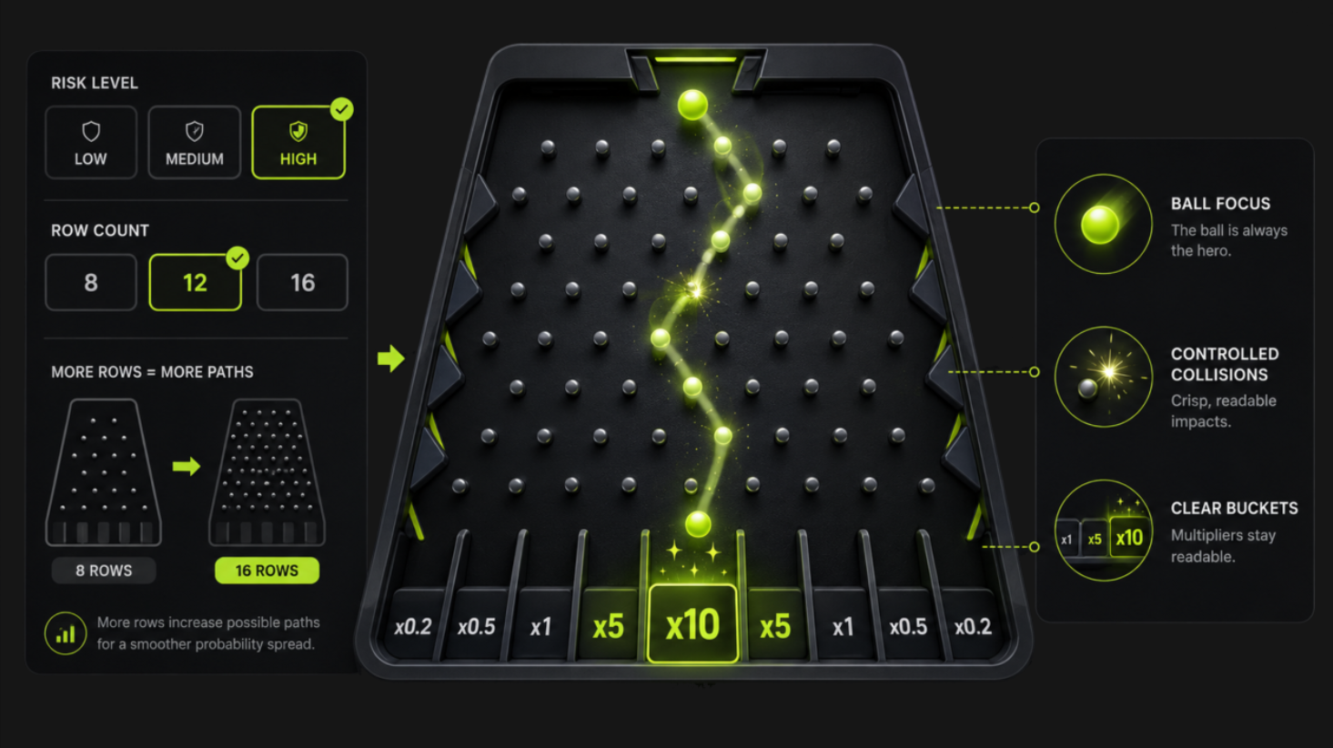
Plinko transforms an abstract distribution into a visible journey. The falling ball, repeated peg collisions and multiplier buckets create a physical metaphor for risk and reward. The player can read the structure before the round begins.
For artists, the key is controlled motion. The ball must remain the focal point while the board, multipliers and surrounding effects stay readable. Collision feedback should be crisp but restrained; too much glow at every peg would flatten the climax.
The official Stake Plinko page highlights selectable risk levels and row counts. Visually, such parameters should change in a way players can perceive before they commit - through labels, state changes and, where appropriate, a clear transformation of the board.
Mines: Turn Hidden Information Into Tension
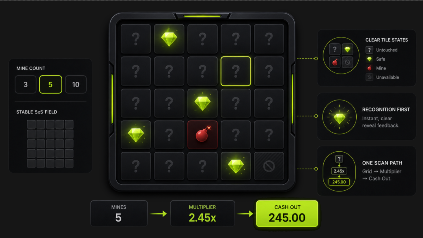
Mines begins with a stable 5-by-5 field and creates tension through unrevealed tiles. The grid is a promise: every square follows the same rule, but every selection changes the player’s emotional state.
Tile states need to be unmistakable: untouched, selected, safe, hazardous and unavailable after the round. The reveal animation should prioritize recognition over spectacle. A player should never wonder which tile changed or whether the result has been registered.
Stake’s official Mines description centers the choice between revealing more tiles and cashing out. The art should keep that decision visible by balancing the grid, current multiplier and cash-out action within one scan path.
Crash: Visualize Time, Momentum and Collective Attention
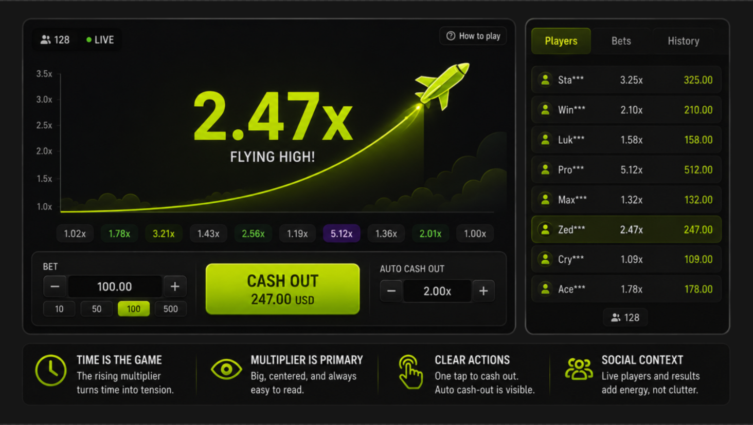
Crash uses a rising multiplier to turn time into the central visual variable. The interface must show motion without obscuring the number that defines the round. The graph, vehicle or character is secondary to the multiplier and the player’s cash-out state.
Because the game is real-time and multiplayer, peripheral information can make the screen feel alive. It should remain visually subordinate: player activity, history and social proof cannot compete with the immediate decision.
The official Stake Crash page describes manual and automatic play in a real-time multiplayer format. For designers, that means the interface needs equally clear feedback for a deliberate tap, an automated action and the end of a round.
Use One Visual Grammar for Every Outcome
Each game benefits from a consistent relationship between anticipation, confirmation and resolution. Anticipation can use a pulse or controlled motion; confirmation can use a clear state change; resolution can use scale, color and sound together.
Do not invent a new animation language for every event. Repeated patterns reduce learning time and help players distinguish ordinary progress from a major result.
The guidance in Slot Game Animation Pipeline Explained is relevant here: animation should be planned as a hierarchy of reusable states, not a collection of isolated clips.
Build Brand Through Restraint
A recognizable brand does not require a screen full of logos. It can emerge from a stable color system, characteristic motion curve, distinctive type treatment and consistent treatment of controls.
Restraint also protects longevity. A compact visual system is easier to extend with seasonal skins or related titles without breaking the game’s core readability.
Use What Makes a Slot Game Look Premium to evaluate polish at the level of consistency, material definition and feedback - not simply the number of effects.
Translate the Lessons Into an Original Concept
Translate the Lessons Into an Original Concept
Begin with a mechanic that can be explained visually in five seconds. Choose one physical or spatial metaphor, define the player’s key decision and list the minimum states needed to communicate it.
Then prototype the result loop with basic shapes. Add theme only after the motion, values and actions remain clear at mobile size. This order prevents a familiar visual motif from substituting for an original interaction.
Stake Originals span several game categories and use provably fair verification, as summarized on the official Stake Originals page. The durable creative opportunity lies in making a transparent rule feel distinctive, not in reproducing an existing skin.
Conclusion
Plinko, Mines and Crash show three different ways to make a simple system emotionally readable: physical motion, hidden information and rising time pressure. Artists can apply the same logic by choosing a clear visual metaphor, making every state unambiguous and reserving the strongest feedback for the decision that matters most.


.svg)


